 Art
Art
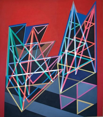
Pop Art borrows its imagery from advertising and mass media; Op Art has no imagery at all, relying purely on geometric pattern to trick the eye. Pop Art emerged first in London around 1955 and then in New York by the early 1960s, as artists like Richard Hamilton, Andy Warhol, and Roy Lichtenstein turned soup cans, comic panels, and celebrity photographs into paintings and prints that treated consumer culture as legitimate subject matter. Op Art followed close behind, developing internationally from around 1960 as artists such as Bridget Riley and Victor Vasarely used precise black-and-white or color patterns to create optical vibration, shimmer, and illusions of movement on a flat surface. Where Pop Art is about what you're looking at — a recognizable object or image — Op Art is about how your eye physically processes what it's looking at, with no subject beyond the pattern itself.
Pop Art vs. Op Art at a glance
| Pop Art | Op Art | |
|---|---|---|
| Years | 1955–1975 | 1960–1970 |
| Origin | London & New York | International |
| Subject matter | Recognizable objects and imagery drawn from advertising, comics, and celebrity culture. | No recognizable subject at all — purely abstract geometric patterns. |
| Color use | Bold, flat, often bright commercial colors mimicking print advertising. | Frequently limited to black and white, or precise contrasting hues, chosen for optical effect. |
| Goal | Comments on or celebrates consumer and media culture. | Creates a physical, perceptual sensation of movement or vibration. |
| Technique | Silkscreen printing and Ben-Day dot patterns borrowed from commercial printing. | Precisely calculated geometric patterns, stripes, and grids painted with exacting control. |
| Viewer response | Recognition and cultural association — you know what you're looking at. | Physical sensation — the eye struggles to settle, producing a felt effect. |
| Key figures | Andy Warhol, Roy Lichtenstein, and Richard Hamilton. | Bridget Riley and Victor Vasarely. |
How to tell them apart
If you recognize what's in the picture — a soup can, a comic-book face, a celebrity portrait — you're looking at Pop Art. If the image is pure pattern, with no object or scene depicted, and staring at it makes your eyes vibrate or the surface seem to ripple, you're looking at Op Art; Bridget Riley's black-and-white stripe paintings are the classic case. Pop Art often uses bright, flat commercial color; Op Art frequently sticks to stark black and white for maximum optical punch. One asks you to recognize a picture; the other asks you to notice what your own eyes are doing.
What they share
Both movements developed internationally around the same years and shared exhibition spaces and audiences as art world attention shifted away from Abstract Expressionism's gestural painting. Both rejected personal, emotional brushwork in favor of precise, controlled, almost impersonal execution. Both also engaged seriously with visual technique and technology, whether commercial printing methods in Pop Art's case or the physics of perception in Op Art's, treating popular and scientific sources as fair material for fine art.
Try both
Settle it yourself — generate the same subject in each style and compare the results.
Frequently asked questions
Are Pop Art and Op Art related movements?
They're contemporaries that developed in similar international art circles around the same years, but they aim at very different things — Pop Art depicts recognizable consumer imagery, while Op Art uses abstract pattern to create optical illusions.
Which came first, Pop Art or Op Art?
Pop Art, by roughly five years. It emerged around 1955 in London and New York, while Op Art developed internationally starting around 1960.
Does Op Art have any recognizable subject matter?
No. Op Art is entirely abstract, built from precise geometric patterns designed to create optical effects like vibration, shimmer, or the illusion of movement, with no depicted object or scene.