 Art
Art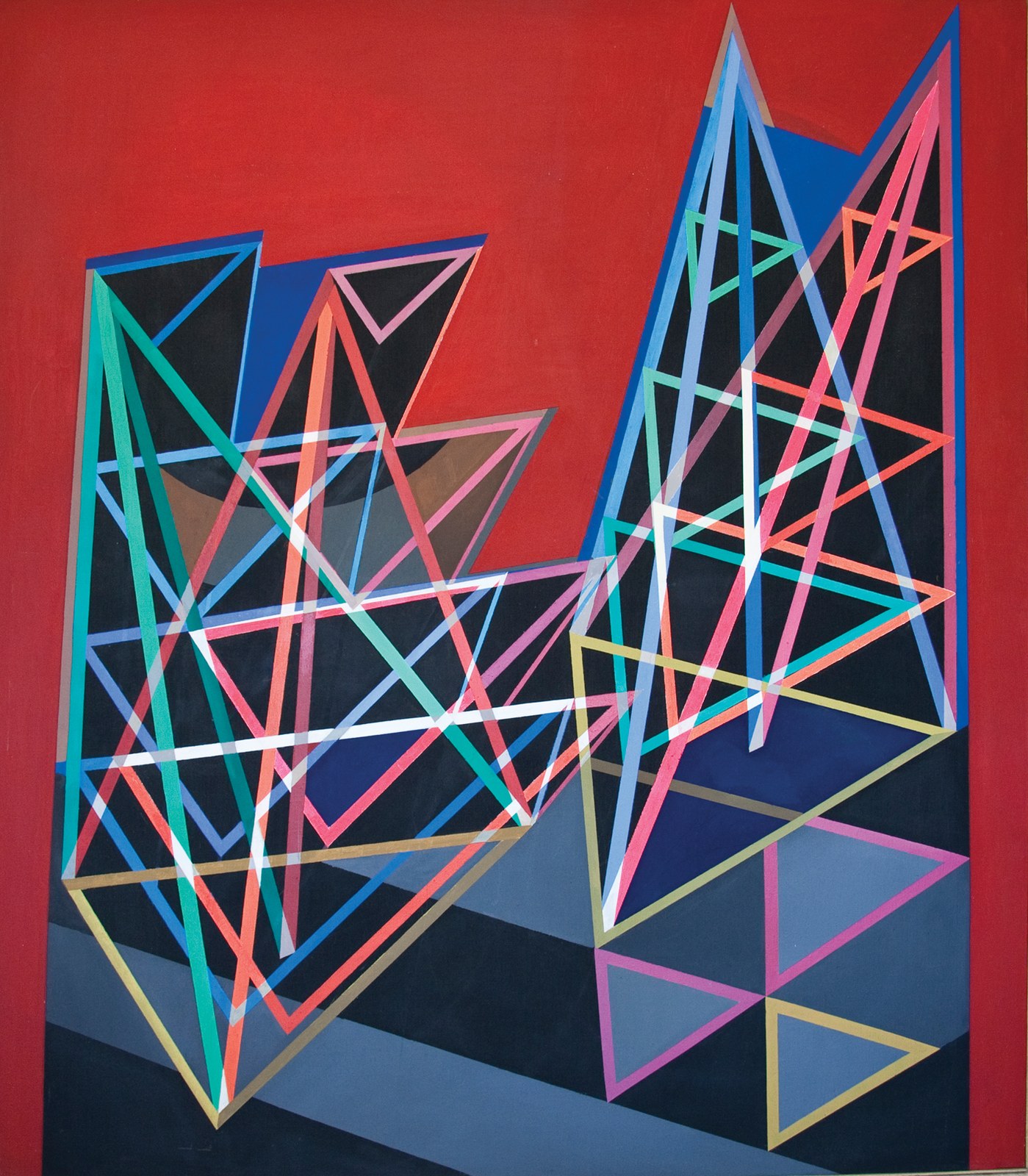
1968 Construction on Red Background. Image: Iawexler · CC BY-SA 4.0 · Wikimedia Commons, accessed 2026-08-04
Op Art, short for Optical Art, describes paintings and reliefs that exploit the mechanics of human vision to produce illusions of movement, vibration, flickering, or depth from an entirely static, flat surface. Working with high-contrast geometric patterns — parallel lines, concentric circles, grids, and moiré interference effects — artists in this mode treated the eye's own perceptual processing as their true subject matter, engineering compositions that seem to pulse, warp, or shimmer the longer a viewer looks at them.
The movement drew on earlier twentieth-century geometric abstraction, particularly the color theory and perceptual experiments of Josef Albers, developed after his Bauhaus years at Black Mountain College and Yale, as well as Constructivism and the mechanized aesthetics of Kinetic Art. Victor Vasarely, working in Paris from the 1930s onward, is often credited as the movement's chief precursor and its most systematic practitioner, developing a rigorous visual grammar of distorted grids and color modulation. In Britain, Bridget Riley translated similar ideas into stark black-and-white paintings whose wave-like line patterns produced an almost physical sensation of movement in the viewer, before she extended the approach into vibrating color in the later 1960s. Venezuelan artist Jesús Rafael Soto pushed the same perceptual concerns into three dimensions, building suspended-rod "Penetrables" and reliefs that shifted visibly as a viewer moved past them.
Op Art rebelled against the emotional gesture of Abstract Expressionism and stood in stark contrast to the contemporaneous detachment of Minimalism, insisting instead that painting could be a precise, almost scientific instrument for producing sensation directly in the body of the viewer. It reached a defining public moment with "The Responsive Eye," a landmark 1965 exhibition at the Museum of Modern Art that introduced the style to a mass audience and, almost immediately, to fashion, textiles, and graphic design. The movement matters because it demonstrated that abstraction need not be reduced to flatness or pure form — it could be actively perceptual, implicating the viewer's own eyes and nervous system as part of the artwork itself.
What defines Op Art
High-contrast geometric patterns
Compositions rely on repeated lines, grids, circles, or checkerboards, most often in stark black and white or intensely saturated complementary colors. The sharp contrast is essential to triggering the eye's optical response.
Illusion of movement and vibration
Careful spacing and repetition of pattern elements cause the eye to perceive flickering, pulsing, or rippling motion in a completely static image. The effect is a physiological response to the pattern rather than any actual movement in the work.
Precision and impersonal execution
Lines and shapes are drawn or masked with mechanical exactness rather than freely brushed, eliminating visible gesture. The impersonal finish reinforces the sense that the work is a calibrated optical device rather than an expressive object.
Moiré and interference effects
Overlapping grids, dots, or lines set at slight angles to one another generate secondary flickering patterns known as moiré effects. Some artists layered transparent materials to let these interference patterns shift as the viewer's position changed.
Color modulation and afterimage
Adjacent complementary colors of similar value are placed side by side so that the eye struggles to fix a stable boundary between them, producing vibration and afterimages. This color-based approach extended Op Art beyond black-and-white line work into fully chromatic experiments.
Kinetic and sculptural extensions
Some artists translated optical principles into three dimensions, using suspended rods, wire, or moving elements so the pattern visibly changed as a viewer walked past. These works blurred the line between Op Art and Kinetic Art.
History
Op Art's roots lie in early twentieth-century investigations of geometric abstraction and visual perception, especially Josef Albers's studies of color interaction, developed at Black Mountain College and Yale and published as Interaction of Color (1963), and Victor Vasarely's experiments with distorted grids beginning in the 1930s. Vasarely's black-and-white "Zebra" compositions of the late 1930s are often cited as an early anticipation of the style, and by the 1950s he had developed a systematic visual language of geometric modulation that directly seeded the movement. Constructivism and the postwar rise of Kinetic Art, which used actual motion and light, provided a further technical and conceptual foundation.
The style crystallized as a recognized movement in the early 1960s, with Bridget Riley in Britain producing stark, undulating black-and-white paintings that drew wide attention, and Jesús Rafael Soto in Venezuela and Paris extending optical principles into sculptural reliefs and immersive installations. The American press coined the term "Op Art," playing off "Pop Art," around 1964 as the style gained visibility.
The movement's defining public moment came in 1965 with "The Responsive Eye," an exhibition organized by curator William Seitz at the Museum of Modern Art in New York, which brought together Vasarely, Riley, Soto, and numerous other international artists and drew enormous crowds. The exhibition's popularity had an immediate commercial afterlife: Op Art patterns were rapidly absorbed into fashion, textiles, album covers, and graphic design throughout the later 1960s, sometimes to the frustration of artists who felt the movement's perceptual seriousness had been reduced to decorative pattern. As a distinct gallery movement, Op Art's momentum faded by the early 1970s, though its core practitioners, particularly Vasarely, Riley, and Soto, continued developing its ideas for decades afterward.
Key works
| Work | Artist | Year | Why it matters |
|---|---|---|---|
| Zebra | Victor Vasarely | 1938 | An early black-and-white composition of curved parallel lines often cited as a founding precursor of Op Art's optical effects. |
| Vega-Nor | Victor Vasarely | 1969 | A geometric grid distorted into a bulging spherical illusion, exemplifying Vasarely's systematic approach to optical distortion. |
| Movement in Squares | Bridget Riley | 1961 | A black-and-white grid of squares that compresses and expands across the canvas, producing a sensation of rippling motion. |
| Blaze | Bridget Riley | 1964 | A radiating pattern of jagged black-and-white lines that appears to pulse and rotate as the eye moves across it. |
How to make art in this style
Working in an Op Art Style
Choose a restrained, high-contrast palette. Pure black and white remains the most reliable route to strong optical vibration; if using color, pair complementary hues of similar tonal value — red against green, or blue against orange — so the eye cannot easily settle on a boundary between them.
Build compositions from repeated geometric units. Parallel lines, concentric circles, grids, and checkerboards are the basic vocabulary. Consistency of unit and interval matters more than variety — the illusion depends on precise, regular repetition rather than improvisation.
Distort the grid gradually. Rather than keeping lines or shapes uniform across the whole surface, compress, expand, curve, or taper them incrementally so the pattern appears to bulge, ripple, or recede. Small, evenly graduated changes across a large field produce the strongest sense of movement.
Eliminate visible brushwork. Use masking tape, rulers, and flat, even paint application — or vector software — to keep edges crisp and hard. Any visible gesture undercuts the impersonal, mechanical precision the effect depends on.
Test at a distance and up close. Optical effects often only activate at a certain viewing distance; step back frequently while working to check whether the intended vibration or movement is actually occurring.
Consider layering for moiré effects. Two grids or line patterns set at a slight angle to one another, especially on semi-transparent materials, generate interference patterns that shift as the viewer moves — an easy way to add a dynamic, kinetic quality to a static composition.
Legacy
Op Art's central insight — that a static, two-dimensional pattern can produce a genuinely physical sensation in the viewer — has remained influential well beyond its 1960s heyday. Its geometric, high-contrast visual language was rapidly absorbed into fashion, textile design, album covers, and later psychedelic and rave graphics, where its capacity to hold attention and suggest motion made it a natural fit for commercial and popular imagery. Digital and screen-based art has repeatedly returned to Op Art's core techniques, since moiré patterns, grid distortion, and color vibration translate directly into pixel-based and generative design. Bridget Riley's black-and-white paintings in particular remain touchstones for contemporary abstraction concerned with perception and embodied viewing, and her later color work influenced subsequent generations of painters interested in optical mixing. Jesús Rafael Soto's immersive, walk-through Penetrables anticipated the participatory, installation-based art that became widespread from the 1990s onward. Op Art also permanently established that rigorous, near-scientific investigation of visual perception could be a legitimate and popular basis for fine art, a premise that continues to inform artists and designers working with pattern, illusion, and the physiology of seeing.
Frequently asked questions
What is Op Art?
Op Art, short for Optical Art, is a mid-twentieth-century movement in which artists used precise geometric patterns to create illusions of movement, vibration, or depth on a flat surface, exploiting the mechanics of human visual perception.
Who is considered the founder of Op Art?
Victor Vasarely is widely regarded as the movement's principal founder, having developed a systematic visual language of grid distortion and optical modulation from the 1930s onward; Bridget Riley became its leading figure in Britain during the 1960s.
What is the difference between Op Art and Kinetic Art?
Op Art creates the illusion of movement on a static surface using pattern and color alone, while Kinetic Art incorporates actual physical motion, using motors, moving parts, or air currents to make the artwork genuinely move.
Why did Op Art become popular in fashion and design?
Its bold geometric patterns and eye-catching optical effects translated easily onto textiles, clothing, and graphics, and the movement's 1965 breakthrough exhibition "The Responsive Eye" at MoMA brought it to mass public attention right as fashion and advertising were seeking striking new visual motifs.
Is Op Art still practiced today?
Yes; its techniques of pattern, moiré interference, and color vibration remain widely used in contemporary painting, digital and generative art, and design, and several original Op Art artists continued producing new work into the twenty-first century.